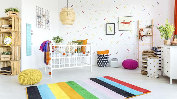
There’s still a month before we step into 2023, but our homes can do that before the clock strikes the witching hour on December 31. All you need to do is bring home one of the many striking colours of 2023.
Artists have long believed that colour can affect moods, feelings, and emotions. American modernist painter Georgia O’Keefe was aware of its ability to evoke feeling. “I found I could say things with colour and shapes that I couldn’t say any other way,” she famously said. And designers are using it to create spaces of all kinds — warm, welcoming, whimsical, restorative, minimalist.
If you’re looking for inspiration but don’t know which way to go, we suggest looking at these five colours that are likely to rule 2023.
Pantone’s choice: Viva Magenta
Described as “a nuanced crimson tone” that balances warm and cool, Viva Magenta is “an unconventional shade for an unconventional time”, Pantone said in a statement. It added that the colour choice reflects the “rebellious” spirit of the time and the renewed interest in creative experimentation following the coronavirus pandemic.
“Viva Magenta descends from the red family, and is inspired by the red of cochineal, one of the most precious dyes belonging to the natural dye family as well as one of the strongest and brightest the world has known,” said Leatrice Eiseman, executive director, Pantone Color Institute. “Rooted in the primordial, [it] reconnects us to original matter. Invoking the forces of nature, Viva Magenta galvanises our spirit, helping us to build our inner strength.”
Where? Use it to create impact in a living room or home office, use velvet furnishings to infuse glamour, or pair with white/light pastels to lighten things up. The shade will work marvellously in a lacquered finish on statement furniture.
Sherwin-Williams’ selection: Redend Point
Sherwin-Williams’s choice for 2023 is Redend Point, which blends blush and beige, and uses subtle pink undertones to warm up walls. The grounding shade is in line with current post-pandemic trends, with homeowners choosing earthy shades that bring comfort and warmth.
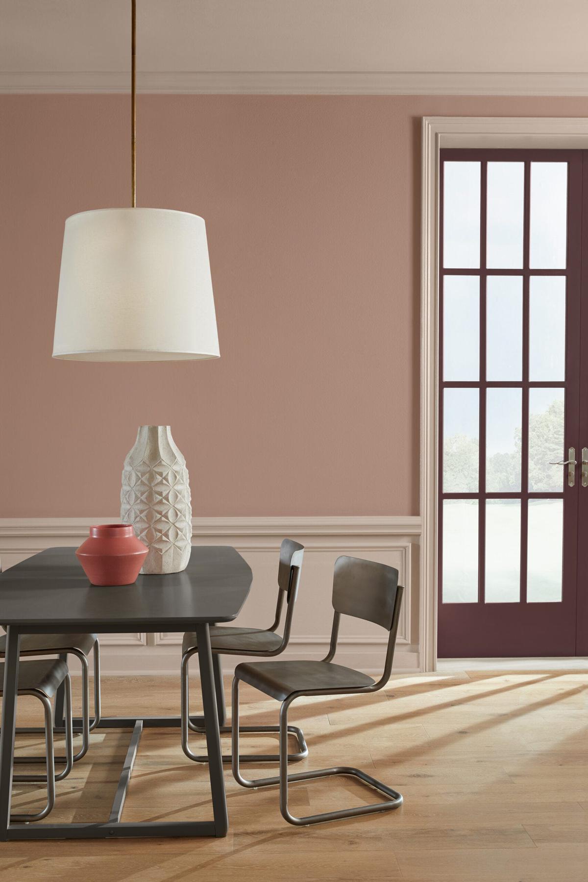
Sue Wadden, director of colour marketing at the American paint and coating manufacturer, has said they wanted the 2023 Colour of the Year to reflect what “we’ve been seeing in terms of neutrals warming up”. The company believes that homeowners are opting for warmer whites, beiges, pinks, and browns to do up their spaces. “Redend Point is an earthy colour, and its subtle pink undertones exude a feeling of warmth and exploration — something people want to feel in their homes. It also leans into the macro trends we’re seeing around empathy and care culture. While self-care is incredibly important, care is also about looking out for each other and our communities,” Wadden said.
Where? This multi-purpose hue can be used to create impact across the home, in entryways and on accent walls, on a statement ceiling or even on furniture.
Behr’s vote: Blank Canvas
Behr Paint Company has chosen to go the soothing, restorative way even as the world slowly returns to life. Blank Canvas, a warm, welcoming white with glossy tones, is a creamy shade that creates the perfect backdrop for almost every kind of space.
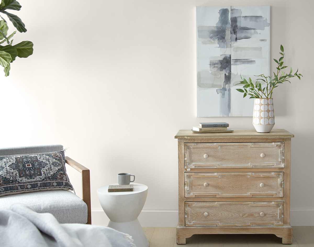
At the announcement, Jodi Allen, global chief marketing officer at the American company, said: “In addition to inspiring renewal, positivity, and a sense of calm, Blank Canvas always makes a design-forward statement, whether you’re a homeowner working on a DIY living space or a professional painter seeking your go-to white to use on countless projects for years to come.”
According to Erika Woelfel, vice president of colour and creative services at Behr, Blank Canvas offers a clean and inviting blank slate that allows individuality and creativity to flow freely. “This white easily harmonises with a wide range of hues, including neutrals, earth tones, and pastels for a charming and cosy appeal,” she said.
Where? In bedrooms to create a relaxing ambience, in dining areas for an inviting feel, and in kitchens/offices to promote creativity.
Dulux’s choice: Vining Ivy
Dulux Paints chose to take a different route by going for a blend of blue and green as its colour of 2023. Vining Ivy, a “bluish-greenish-something-in-betweenish” colour, stands for adaptability and can play myriad roles with ease — think accent shade or focal wall colour, depending on the ambience you are looking for.
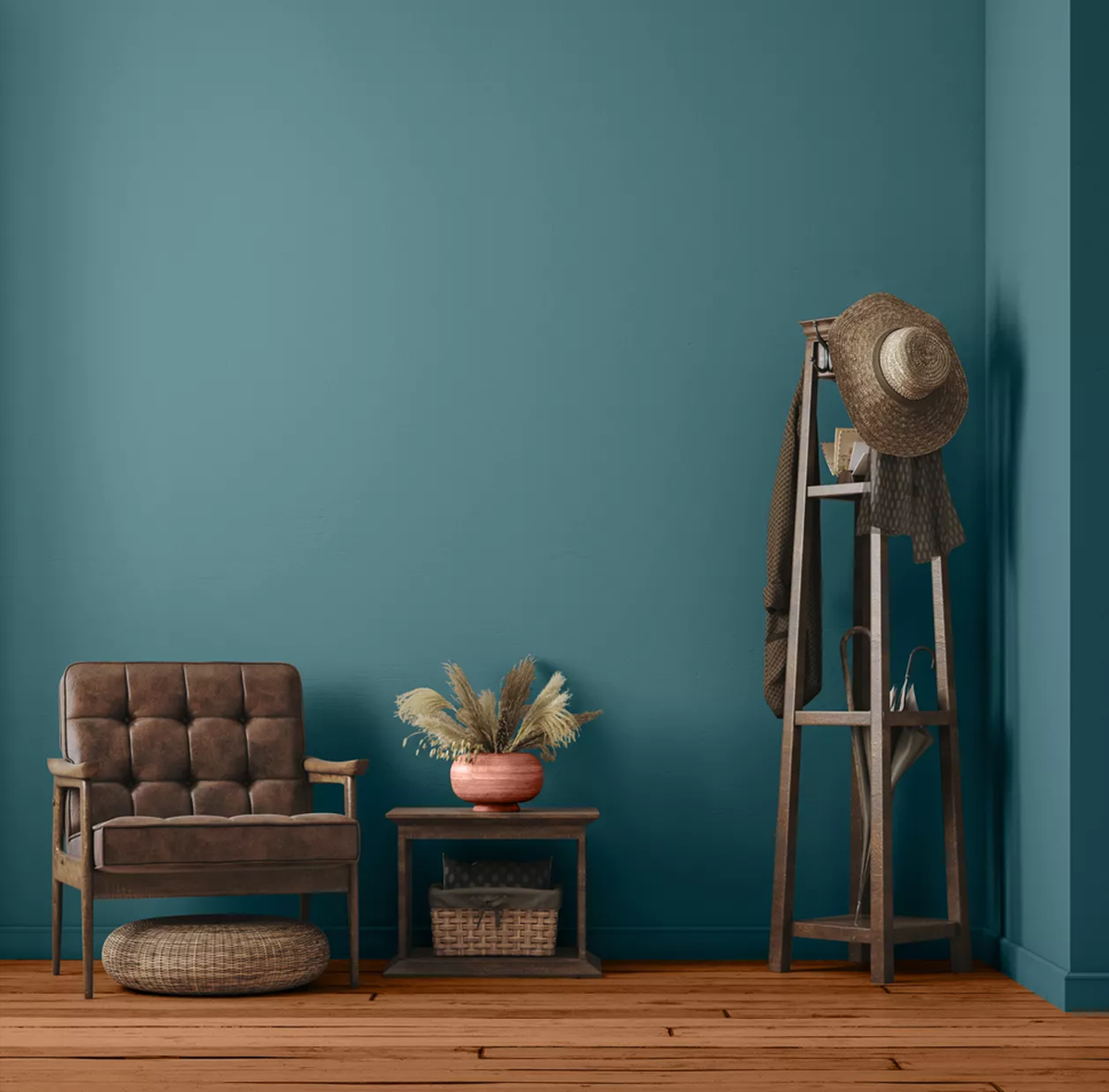
Mitsu Dhawan, Dulux’s brand manager, said: “As opposed to softer neutrals that have been popular in recent years, the new nature-inspired tones are bolder and more expressive, reflecting an optimistic mood as we emerge ready for the next normal.” Interestingly, colour experts at American pain maker Glidden also named the moody Vining Ivy their pick for Colour of the Year 2023. The deep jewel tone is ideal for dramatic decor statements, but can also be used to create small-scale impact.
Where? Use on an accent wall or kitchen cabinetry to create impact. Pair with dark woods and golden accents for an opulent look or try pine wood and white trim for a Scandi feel.
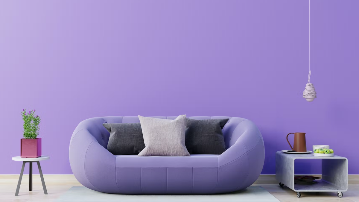
Coloro + WGSN’s pick: Digital Lavender
It’s not just paint manufacturers who are making their choice. British consumer research company WGSN and colour experts at Coloro have pinned their bets for 2023 on Digital Lavender, a soft pastel that exemplifies serenity, stability, and “digital escapism”.
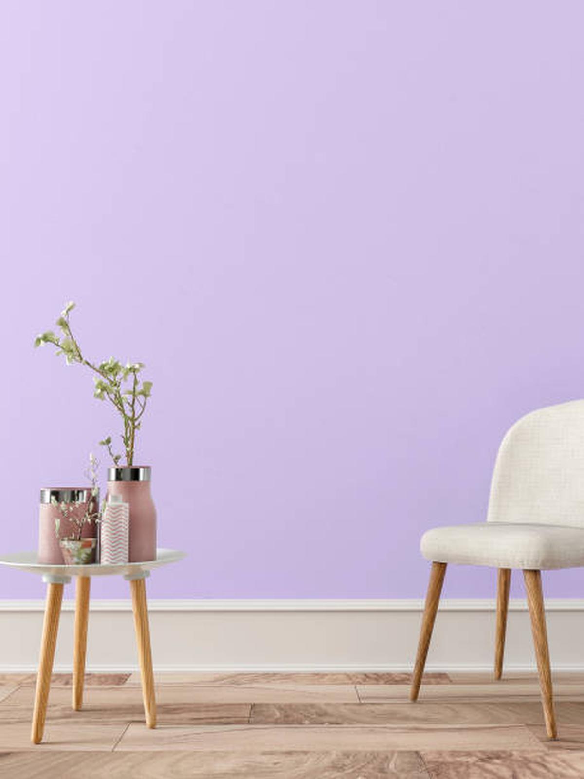
Gemma Riberti, WGSN’s head of interiors, has said the colour is a sensorial shade that connects to holistic well-being and digital optimism. “This shade poses that much needed cautious optimism and escapism that people are craving post-pandemic. And even in times of budget crunch, it is imaginative and creative but also speaks of hope and balance.”
The colour has its roots in the royal colour purple, which is also associated with mysticism, magic, and curiosity. Digital Lavender, on the other hand, evokes calmness and serenity. It has found favour with thousands; many colour experts are also predicting that it will be Pantone’s choice for Colour of 2023.
Where? It works especially well in soft furnishings and décor accents. Try bedding, throws, bath ranges, glazed ceramics, tinted glassware, and more.
Dutch Boy’s selection: Rustic Greige
Neutrals can never go out of style, and American company Dutch Boy is showing why with its goes-with-everything choice for 2023: Rustic Greige. Grey and beige marry and take on subtle red undertones to create a colour that promises safety, serenity, harmony, and comfort.
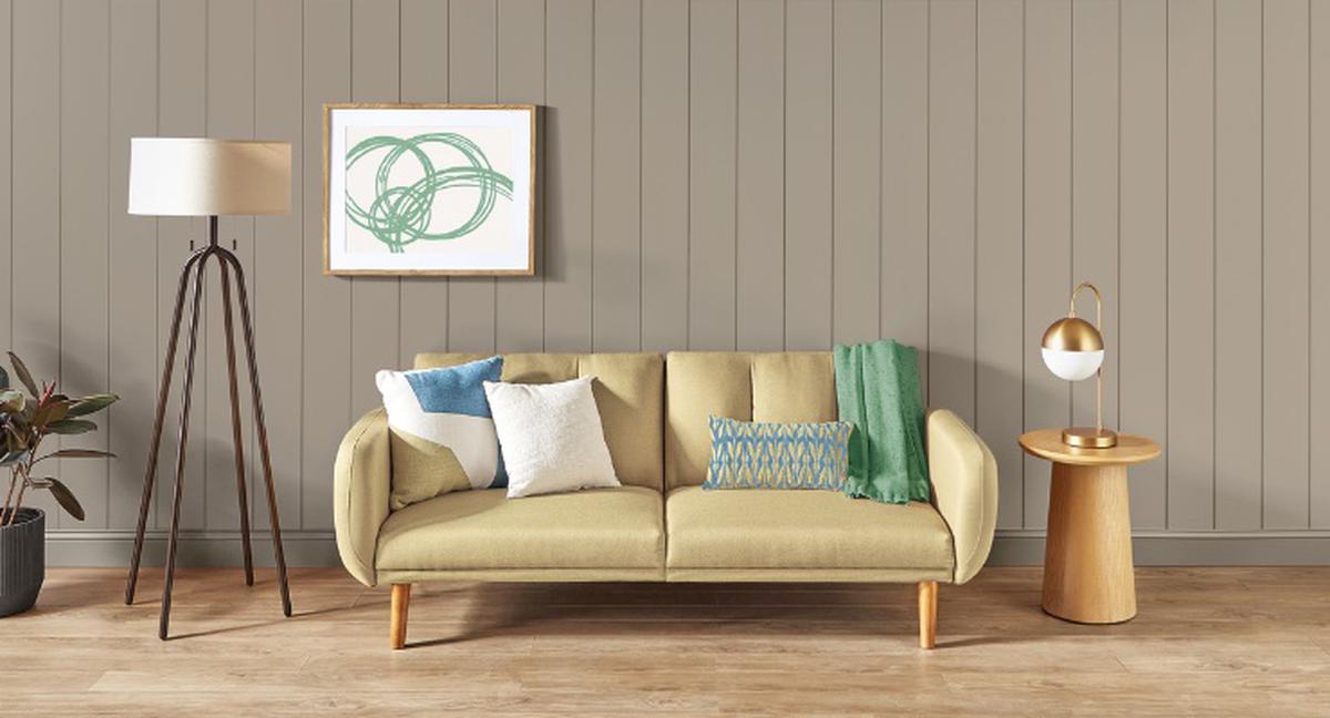
According to Ashley Banbury, senior colour designer, Dutch Boy Paints, the importance of overall well-being remains a primary focus in everyday lives. “[The] One-Coat Colour of the Year is all about the need to escape, relax and recharge. It’s about retreating to a calmer, simpler lifestyle inspired by the peace and clarity of tones derived from nature.”
The versatile neutral promises to score on all fronts. Its adaptability means it works well with warm and cool tones, and it can be the best backdrop for all kinds of accents. Rustic Greige works as the grounding colour for all three Dutch Boy’s 2023 Colour Trend palettes: Plush, Wistful, and Botanic.
Where? Use it to warm up a sterile kitchen, create a soothing bedroom, or an evocative workspace. Team with bright colours for a space that pops or with darker neutrals to create a modern feel.


