[ad_1]
Mumbai-based architect and designer Rooshad Shroff, who was the associate designer of India in Fashion discusses lighting challenges, documentation and exhibition design. Edited excerpts:
Rooshad Shroff
The exhibition has been imagined as curatorial chapters. Was there any segment that was difficult to execute technically, given the interplay of spaces versus curatorial?
Actually, it being set up as chapters really helped us to define each of the spaces and also allowed for a very strong design language that could be independent from chapter to chapter. So, in that sense, it did aid the design process, especially to form a stronger link between the chapters and the physical space.
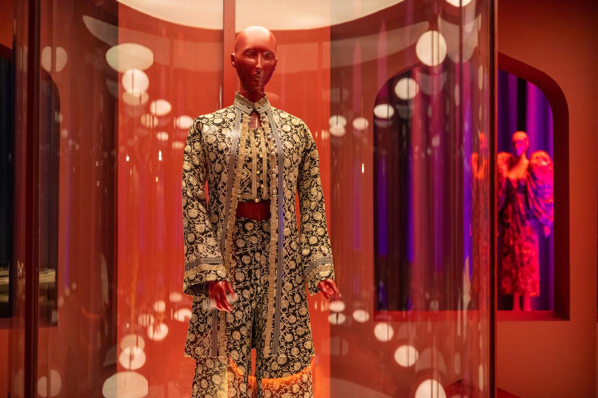
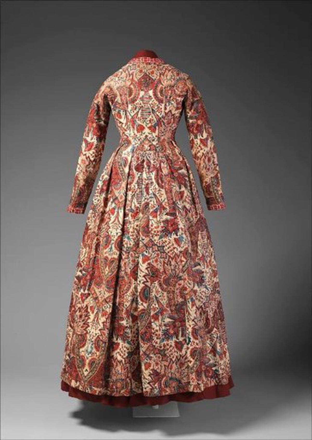
For example, if you look at the Chintz Section, which was number three, it lent itself to a Mughal garden. The idea was that of an area where you have plantations and a sense of being near water as you walk through, with floral imagery bringing the garden to life. Or if you look at a section like the Hippie Trail, which was number nine, it represented the time when people, fed up with turmoil, were coming to India for an alternative truth or reality. Which takes us to the flower power era, and people coming in through Nepal and then Jaipur. We tried to capture that with the idea of the Jaipur Observatory and Jantar Mantar.

The Hippie Trail
| Photo Credit:
Mitsun Soni
Technically speaking, I think the YSL chapter was quite challenging. It was inspired by the stepwells. We’ve rendered it through these very thin wire mesh material, which allows a certain translucency throughout. Each of the pieces had to be welded together, and it was done by hand, which was labour intensive. The Great Exhibition was another challenging chapter in terms of pure scale and structure, as it had to be a recreation of the original exhibition of 1851. It was a complete steel structure that we created and moved into the exhibition space. To make sure that structurally it’s stable and yet recreate that large volume was something that was challenging yet exciting to put together.
Why is so much of the exhibition text in darkness?
It is not just the text that is in darkness, it is more about the larger space within which we are viewing the text, and pre-empting the need for sensitive lighting for the preservation of the exhibits themselves. A lot of the garments at the exhibit are very old — some almost 300 years old! The oldest that we have is a 1750s garment. A lot of these cannot be exposed to a large LUX level [lighting level intensity]. In fact, a lot of the museums mandated a LUX level of 30-50. In order to make sure that they were all preserved well, we had to keep the light levels slightly low.

Tea gown lent by The Metropolitan Museum of Art
The exhibition is extraordinary in concept and scale of imagination. Have you considered leaving behind a legacy through documentation for students of design?
The concept is larger-than-life even for the curators. While the exhibit and its many details have been extensively documented in photos and videos, the main repository of the information — on basis of which we imagined the exhibition — lies with the eponymous, gorgeously-illustrated coffee table book, India in Fashion: The Impact of Indian Dress and Textiles on the Fashionable Imagination, written by curator Hamish Bowles. The visually-rich book contains a wealth of fascinating and insightful scholarly notes by renowned curators, historians and journalists in the fields of fashion, textile and art history.
I think exhibitions of this kind, be it fashion or something else, are fundamental to any city or culture — for people to visit, to broaden their horizons and learn. And this is hopefully the first of many that we get a chance of experiencing in Mumbai. If you look at this one in particular, it’s quite interesting because there are so many people who visited it and said, “Oh, we had no clue that India has been this big a source of influence!” What tends to happen is that people just look at India’s influence as a back-end one — of production, mostly embroidery. But it has been so much more. And I think this exhibition helps define the varied sources of influence, whether it’s through textile, craftsmanship, silhouettes, the drape of the sari, brocades, zardozi, and so many other elements.

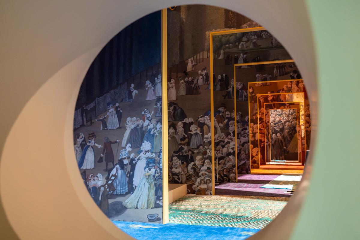
The Journey of the Sari at ‘India In Fashion’
| Photo Credit:
Mitsun Soni
The design of some of the chapters (such as YSL) takes away from the experience of seeing the costumes up close. Was this deliberate?
I think there are different ways of viewing a particular garment. With even a painting, for example, you don’t always want to see everything up close, there are these layers of information that you want to observe, and then look for certain details. You might want to see something really up close, at eye level, such as the exhibits in the Chintz Zone — you really want to see the details in the colours of those flowers. But sometimes, certain pieces you want to view as silhouettes, such as a larger drape, so you need to step back. You don’t want everything to be at one level, or static.

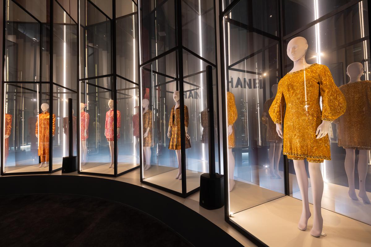
The influence of India in the work of Chanel
| Photo Credit:
Mitsun Soni
The layout was designed to offer that kind of a viewing distance. And, of course, to create a certain sense of drama. Some of the garments allow you to be at a higher level, letting your eye wander across that space so there is an element of movement. This way you see much more of the architecture of the display as against only one exhibit after the other in a relatively rigid format — which also works in some cases, like what we’ve done in the Chanel section. Interest is piqued when there’s variation in the form of display.
The writer is an independent curator and the founder-director of Eka Archiving Services.
[ad_2]
Source link


