[ad_1]
Apple’s winning formula has always been its focus on design and the magic of simplicity. The launch of the iMac G3 in 1998 was the beginning of a design revolution, which later got carried forward with the iPod, iPhone, iPad and Apple Watch. Whether it’s the iPod’s click-wheel to navigate the user interface to the iPhone’s multi-touch display, Apple’s approach to designing products has been different and unique. But there have been times when Apple was questioned for its odd design choices. With Cupertino getting a lot of backlash for the 10th gen iPad requiring a dongle to charge the Apple Pencil, we look at five instances Apple has provoked design debates with its products.
Magic Mouse 2 (2015)
Announced in 2015, the Magic Mouse 2 has been hailed as a “beautiful mess” by critics and fans alike. While the mouse looks sleek and has multi-touch controls, the way you charge the device is a bit odd. One needs to actually flip the mouse over to charge it, making it unusable while powering up. Apple could have added the port on the front of the Magic Mouse 2; instead, the charging port is tucked into the base of the device. It’s puzzling to see Apple still continue to support and ship the Magic Mouse 2 with the iMac M1.
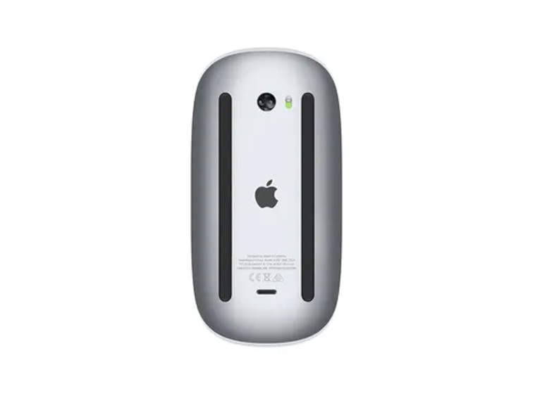 You have to flip the mouse over for charging, which is annoying. (image credit: Apple)
Mac Pro (2013)
“Can’t innovate no more, my a**,” Apple senior vice-president of marketing Phil Schiller famously said as he introduced the new Mac Pro at the 2013 Worldwide Developers Conference. At the time, Schiller’s comment was seen as a bold return to the top-end of the desktop market. The $4000 Mac Pro, which looked like a “trashcan”, had a bizarre and beautiful design, a device only Apple’s star designer Jony Ive could have thought of. But the machine had little internal expandability which irked professional users and Mac enthusiasts, a design flaw which even Apple later acknowledged. It was a classic case of form over function.
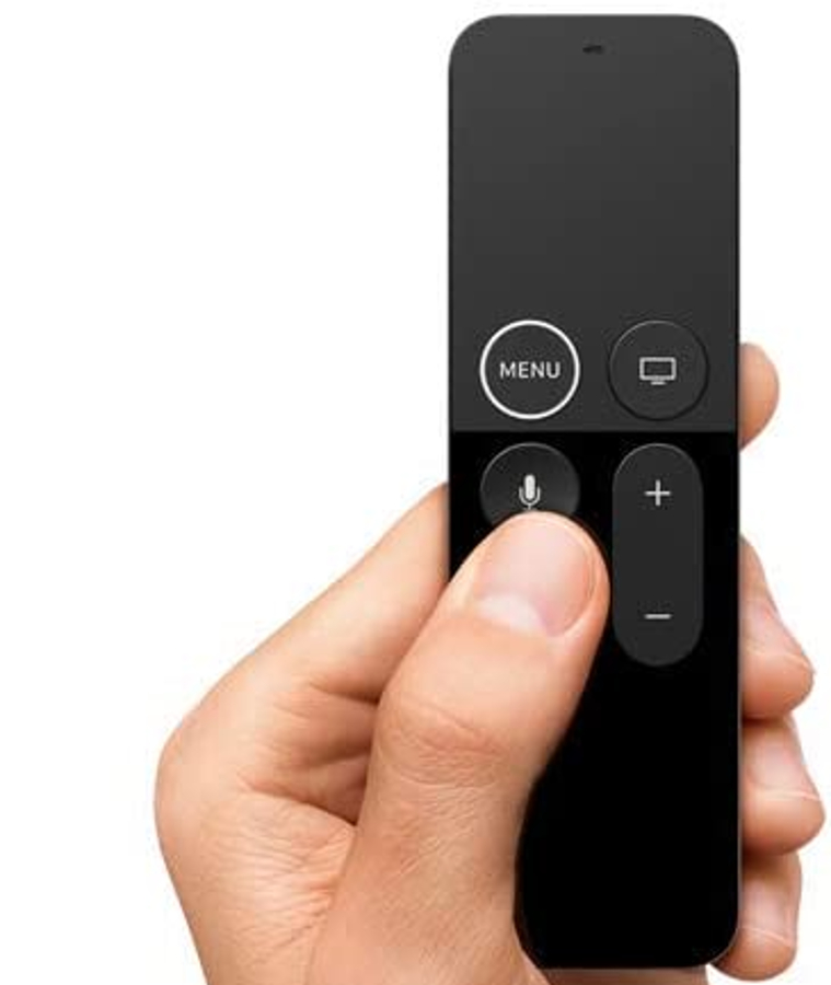
 The Siri Remote made its debut in 2015 alongside the fourth-gen Apple TV. (Image credit: Walmart)
Apple Siri remote (2015)
Everyone seemed to hate the first-generation Apple TV Siri remote. The Jony Ive design was beautiful but practically useless. The sleek-looking remote consisted only of a trackpad and about six buttons, including one that calls up Apple’s voice assistant, Siri. The trackpad certainly felt futuristic, bringing touchscreen functionality in games to TV but the Siri remote’s over simplicity and minimalism frustrated users. Navigating TV menus was difficult and less precise. On top of that, the Siri remote was so delicate that it was difficult to grip. Years later, in 2021, Apple finally fixed the Siri remote design and introduced a new click-wheel design reminiscent of early iPods to navigate interface when it started selling the updated Apple TV.
Terrific mouse!
I used that one for years.
This one, in the other hand (pun intended), drove me to a trackball… pic.twitter.com/braz1ja7d3— Barry Wainwright (@bnwainwright) November 22, 2019
https://platform.twitter.com/widgets.js
iMac’s ‘hockey puck’ mouse (1998)
The Apple hockey puck mouse was a design disaster. Shipped with the original iMac in 1998, the mouse looked different with a circular disk-like shape and see-through internals matching the translucent design of the iMac G3. This was the very first mouse to ever use USB as the standard for connectivity. Ergonomically, however, the mouse was uncomfortable to use due to its round design and one would struggle to hold it with two fingers. The mouse lasted for two years and Cupertino eventually replaced the hockey puck mouse with the Apple Pro mouse which had a more traditional design. Although the hockey puck mouse was short-lived, the device is now highly-priced among vintage Apple collectors.
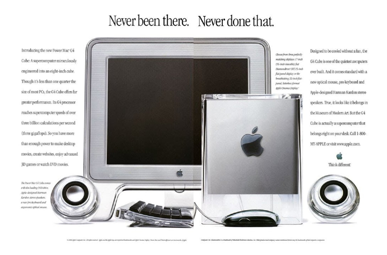
 The G4 Cube had a very short lifespan and only 349 days after it was announced by Steve Jobs in 2000. (Image credit: Advertising material)
Power Mac G4 Cube (2000)
Jony Ive’s Power Mac G4 Cube design was striking. The machine came suspended in an acrylic glass enclosure to give the impression that it was floating. The 8-inch cube-shaped computer was a visual stunner packing a G4 processor, a vertical slot-loading optical drive, hard drive, RAM, video card, and an array of ports all packed into that tiny space. It was a futuristic computer with no fans and used passive cooling through a large vent on the top. But the G4 Cube was riddled with problems at the surface level and that led to the failure of the product. From complaints of overheating and cracks to component failures and lack of upgradability, the G4 Cube which initially was praised for its cutting-edge design soon became the but of jokes for its underwhelming performance. Seeing the negative reception, Apple had to cut the price of the G4 Cube from $1799 to $1499, ultimately ending production one year after launch. Despite critical flaws and commercial failure, the G4 Cube earned its place in New York’s Museum of Modern Art and is again a priced collectible.
!function(f,b,e,v,n,t,s)
{if(f.fbq)return;n=f.fbq=function(){n.callMethod?
n.callMethod.apply(n,arguments):n.queue.push(arguments)};
if(!f._fbq)f._fbq=n;n.push=n;n.loaded=!0;n.version=’2.0′;
n.queue=[];t=b.createElement(e);t.async=!0;
t.src=v;s=b.getElementsByTagName(e)[0];
s.parentNode.insertBefore(t,s)}(window, document,’script’,
‘https://connect.facebook.net/en_US/fbevents.js’);
fbq(‘init’, ‘444470064056909’);
fbq(‘track’, ‘PageView’);
[ad_2]
Source link


